If you have ever saved a wallpaper reference, you know the hesitation. On a small screen, a floral print looks good. A stripe looks good. A geometric repeat looks good. A room that carries the same mood through curtains and rugs can look more confident and more finished.
Then you imagine it in your own home, and the questions arrive quickly. If one patterned wall already feels like a lot, would a room wrapped in pattern feel cramped? Would the look stay beautiful after you see it every day? What happens when furniture, lighting, and storage enter the room and every pattern starts competing?
This is where pattern drenching becomes useful as a way to read the room. It treats wallpaper, curtains, rugs, and fabric as one rhythm, then asks where that rhythm feels comfortable and where it starts to feel busy. Alongside the pattern itself, you decide how far it repeats, where it stops, and which surfaces stay quiet.
When a pattern looks beautiful but feels risky at home
Pattern usually becomes uncomfortable because of how it is placed, not because the pattern itself is wrong. A wallpaper can be beautiful. A curtain can be beautiful. A rug can be beautiful. The problem starts when they all speak at the same scale inside one room.
A small floral wallpaper, checked curtains, a graphic rug, and a strong wood grain can each work on their own. Together, they can leave the eye with nowhere to rest. The room starts to feel fuller than its actual size because the eye keeps finding something new to read.
Some rooms can hold a large pattern and still feel calm. In those rooms, pattern is not absent. The roles are separated. If the wall speaks, the floor supports it quietly. If the curtain carries the pattern, the bedding steps back. Even when there is a lot of pattern, not every surface speaks at the same speed.
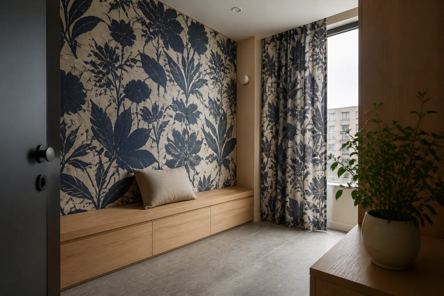
Pattern drenching is about quiet surfaces as much as pattern
Pattern drenching is often described as using pattern across walls, ceilings, curtains, and textiles. International interior publications have been treating wallpaper and full-room pattern as part of the 2026 interiors conversation. At home, though, the better question is not how bold the room can become.
The first question is whether the pattern can read as a background. The same pattern can run across a whole wall and still feel steady when the contrast is low, the furniture is simple, and the floor stays quiet. A single patterned wall can feel busier if the contrast is high and other patterns already fill the room.
So pattern drenching is a question of density before it is a question of quantity. Scale, repeat, contrast, covered surface, and resting planes have to work together. When one of them becomes too strong, the room quickly starts to feel crowded.
The Pattern Density Map
Before a consultation, it helps to fill in the checks below. Pattern drenching can leave you stuck between "I love it" and "it might be too much" if you judge it only by taste. When you break the pattern into smaller decisions, it becomes easier to see where to be bold and where to lower the room's volume.
| Check | Question to ask first | Busy-room signal | How to lower it |
|---|---|---|---|
| Pattern scale | Is the repeat small, or is the motif large? | A small repeat covers too much surface and gives the eye no rest. | Start large motifs on one surface; keep small repeats lower in contrast. |
| Repeat contrast | How far apart are the ground color and the pattern? | High contrast continues across walls, curtains, and rug at the same strength. | Make one layer, such as the curtain or rug, a solid color. |
| Covered surface | Does the pattern cover walls, ceiling, textiles, or floor? | Eye-level surfaces and floor both compete. | Keep one visual layer quiet. |
| Resting plane | Is there a plain floor, wood plane, linen layer, or low furniture nearby? | Furniture and objects compete with the pattern. | Put a solid material directly beside the pattern. |
| Room use | Is this a room you stay in, or one you pass through? | A strong repeat fills a bedroom or living room all day. | Try an entry, powder room, or small corner first. |
| Reversibility | Can the layer be changed later? | The boldest pattern starts as a fixed finish. | Start with fabric, rugs, or removable wallpaper. |
This map is not a rule for making every pattern smaller. It is a way to decide where pattern can expand and where the room needs rest. If the pattern is too quiet, you can give it more surface. If it is strong, lower the contrast or quiet the neighboring layers.
Start with a contained room or an uninterrupted wall
It is hard to judge pattern if you begin with the whole living room. Living rooms already contain a sofa, TV, storage, rug, lighting, plants, and many small visual anchors. If a strong patterned wall enters that mix, it can become unclear whether the pattern or the furniture is meant to lead the room.
A small powder room, entry, end-of-hallway wall, or bedroom corner is an easier place to test the idea. These areas are more contained. You do not look at them for as long, and doors or circulation naturally break the scene. Even if the pattern is memorable, it does not have to carry the whole home.
When you choose the wall, look for a surface that is not constantly interrupted. A wall cut by doors, windows, switches, storage, and large furniture breaks the repeat too many times. A wider, calmer wall lets the pattern read more like a background.
If wallpaper feels like too much, lower the repeat through fabric and rugs
Pattern drenching does not have to start with wallpaper. Curtains, bedding, cushions, sofa fabric, and rugs can carry the idea first. These layers are easier to change than a fixed finish, so the cost of a wrong choice is lower.
A large floral curtain can change the room without covering the walls. If the curtain carries the pattern, the wall can stay solid. If bedding and rugs repeat a low-contrast palette, the room can feel connected without every surface speaking at full strength.
Use a rug to keep the repeat low
A rug lowers the pattern to the floor. The eye-level surfaces can stay quiet while the floor creates rhythm. If pattern feels risky in a living room, a rug may be a better first move than a wall. It anchors the seating area, but it does not fill your view the way a wall can.
Leave a quiet plane next to the pattern
Rooms with a lot of pattern still feel livable when they keep a quiet plane nearby. That plane can be a plain wood desk, a light floor, linen bedding, low storage, or a matte wall. It is not an empty part of the design. It gives the pattern something to lean on.
For example, a calm wood desk in front of patterned wallpaper can make the wall feel steadier. Solid bedding beside a large patterned curtain can make a bedroom feel less tiring. If a graphic rug is strong, the sofa and wall need to stay quieter.
The resting plane has to be large enough and close enough to matter. A small solid object in the corner may not be enough. The quiet surface needs to sit near the pattern, near eye level or near the place where the body stays longest.
Look at repetition and rest, not just the pattern itself
When you save pattern-drenching references, look at three things before you focus on the motif. Where does the pattern start, and how far does it continue? How strong is the contrast? What quiet surface sits next to it?
Instead of saying, "I like this wallpaper," try making the reference more specific.
"I like the full-wall effect, but I want the floor and furniture to stay quiet."
"I want the curtain and cushions to repeat the pattern, but I want the bedding to stay solid."
"I want to try this in an entry or powder room before using it across the whole living room."
These sentences do not reduce your taste. They make it easier to decide how far the pattern can go.
Pattern drenching does not have to make a home busier. When it works, the pattern stops floating around as decoration and starts acting like the room's background. The important move is not to use more pattern with more courage. It is to give the pattern somewhere to rest.