A room can look too quiet even when nothing is wrong with it. The walls are bright, the floor is safe, and the furniture does not call too much attention to itself. The room works, but in a photo it can feel flat. That is when a colored chair, a cushion, a small shelf, or one painted detail starts to look tempting.
The worry comes right after that. Will the room suddenly look busy? Will the color feel fresh now and tiring later? If one wall is painted, what happens if the decision feels wrong after a few months?
Accent color works best when it starts with restraint. Before choosing the color name, look at where the color will appear, how much of it will be visible, how strong it is, and how easily it can be changed later.
Location Comes Before the Color Name
Accent color usually becomes uncomfortable outside the paint chart. It becomes too much when it lands in a place the eye meets often, covers more area than expected, or sits too far away from the surrounding neutral tones.
The same green can play very different roles. On one or two cushions, it can feel seasonal. On two dining chairs, it creates rhythm. Across the lower kitchen cabinets, it becomes part of the home's identity. Across an entire living-room wall, it becomes the background the household sees every day.
The size of a color is not only its physical area. A color at eye level feels larger. A color at the end of a circulation path stays in memory longer. A color near a window or under a lamp can read more clearly than the same color in a dim corner. Even a small color changes the room when the eye returns to it often.
So the first question is not "which color do I like?" It is "where will this color be seen the longest?"
Accent Color Area-Location-Saturation Rubric
This rubric is useful before a consultation. Accent color can feel too strong when it is chosen only by instinct, but it can also disappear when every choice is made too safely. Separating area, location, saturation, replaceability, and repetition gives the decision a usable middle ground.
| Criterion | First question | When the color starts to feel heavy | Safer way to give it strength |
|---|---|---|---|
| Area | How much of the home will show this color? | A strong color covers a wall, a large cabinet, a rug, or another surface the household sees for a long time. | Start with small objects, chairs, compact storage, or partial shelving. |
| Location | Does the color sit at eye level or at the end of a path? | The color is visible from the entry, or it stays at the center of the view from the sofa. | Place it slightly to the side, lower in the room, or where it appears after a turn. |
| Saturation | How far does the color stand out from the neutral tones around it? | The color separates sharply from white walls or pale flooring. | If the color is strong, reduce the area. If the area is large, lower the saturation. |
| Replaceability | Can it be changed later without major work? | Strong color appears on tile, built-in cabinetry, or a large wall. | Use fabric, lampshades, chairs, or small furniture first. |
| Repetition | Is the color isolated in only one place? | One accent floats by itself and does not connect to the rest of the room. | Repeat the same color in two or three small places, or pair it with a similar temperature. |
The table is not a rule for making color tiny. It is a way to set the order of the decision. First check whether a small color is enough. Then decide whether the color can move onto a fixed surface. If the color feels weak, increase the area a little. If the color feels strong, reduce the area or move it to a quieter position.
Start With Colors You Can Move
If you are adding accent color for the first time, movable pieces are easier to test. Cushions, rugs, small chairs, stools, floor lamps, framed prints, and vases can change position or leave the room without construction work.
These elements do not have to carry the whole space. They change the expression of the room. A reddish-brown cushion can warm up a beige living room. An olive chair beside a pale wood dining table can give the room a calmer center. A small blue stool in a white bedroom can make the room feel less empty.
The advantage is adjustment. If the color feels too strong, you can move it to another room, mix it with quieter fabrics, or remove it for a season. That risk is much smaller than committing the color to a wall or built-in piece from the start.
When a small accent feels too weak, repeat the family of color in more than one place. One cushion may look isolated. A cushion, a book spine, and a small vase can make the same color feel intentional without increasing the size of any single object.
Start With Small Colors You Can Move
Chairs and textiles are easier to change later. Use them to test how much a small color shifts the eye.
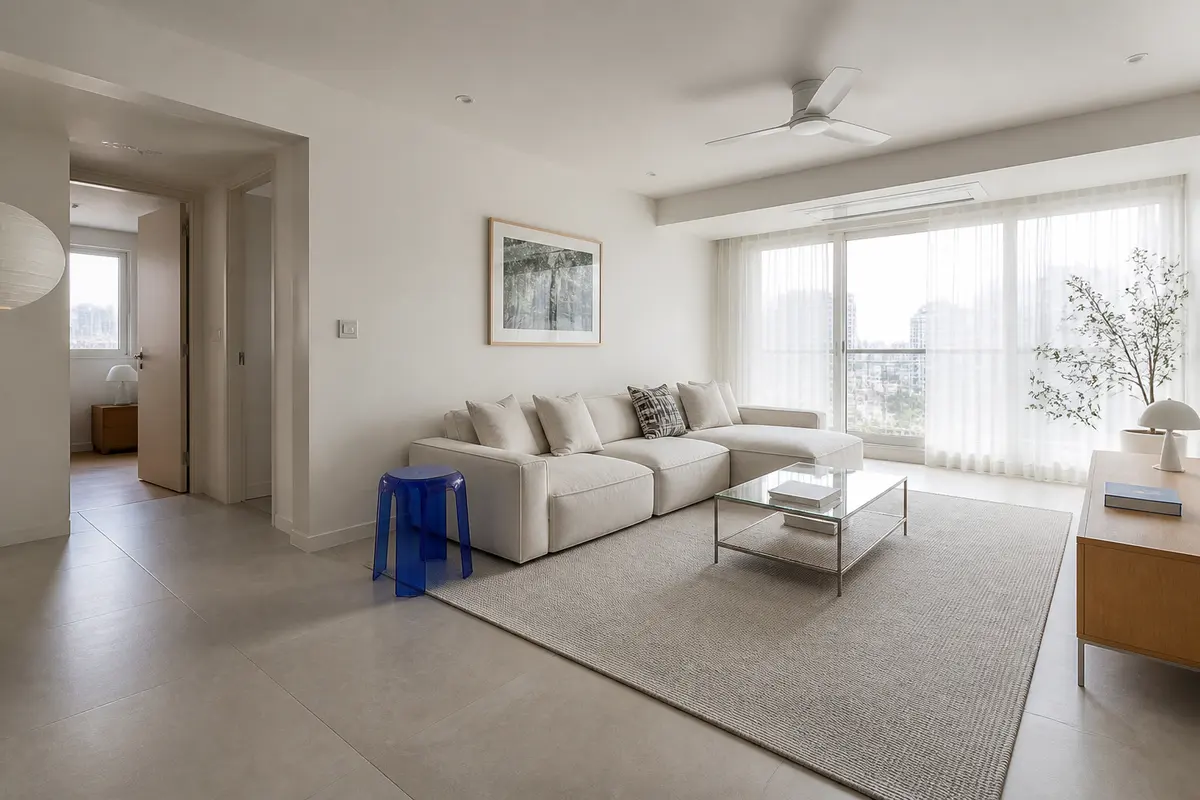
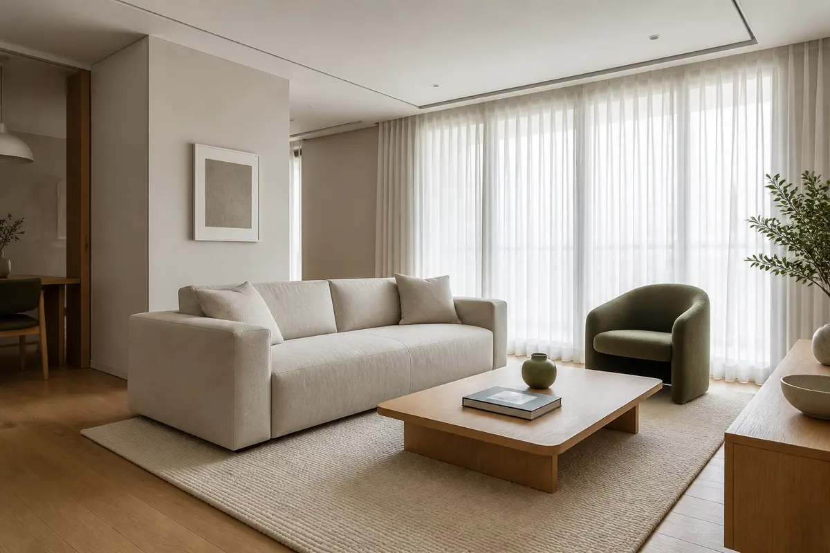 Movable accentA Living Room Centered by an Olive ChairWarm white and oak stay quiet, while one low-saturation green chair gives the eye a place to pause.View reference
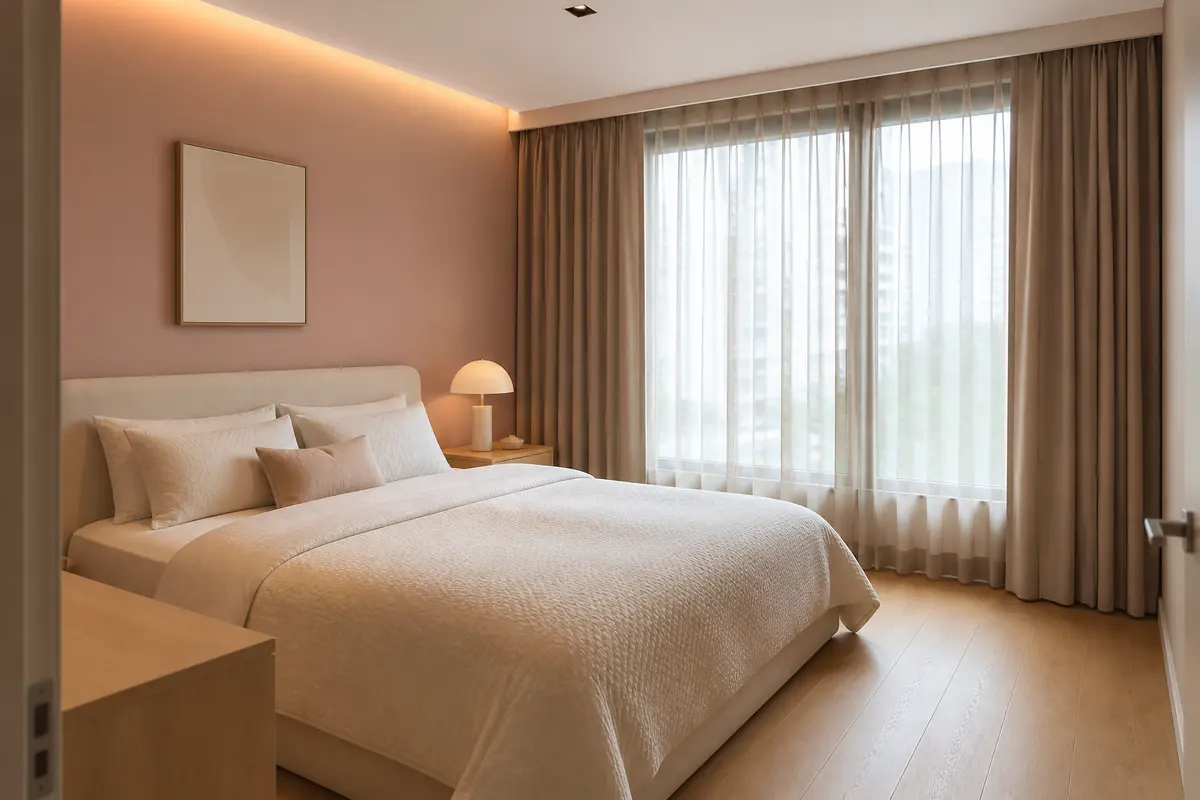
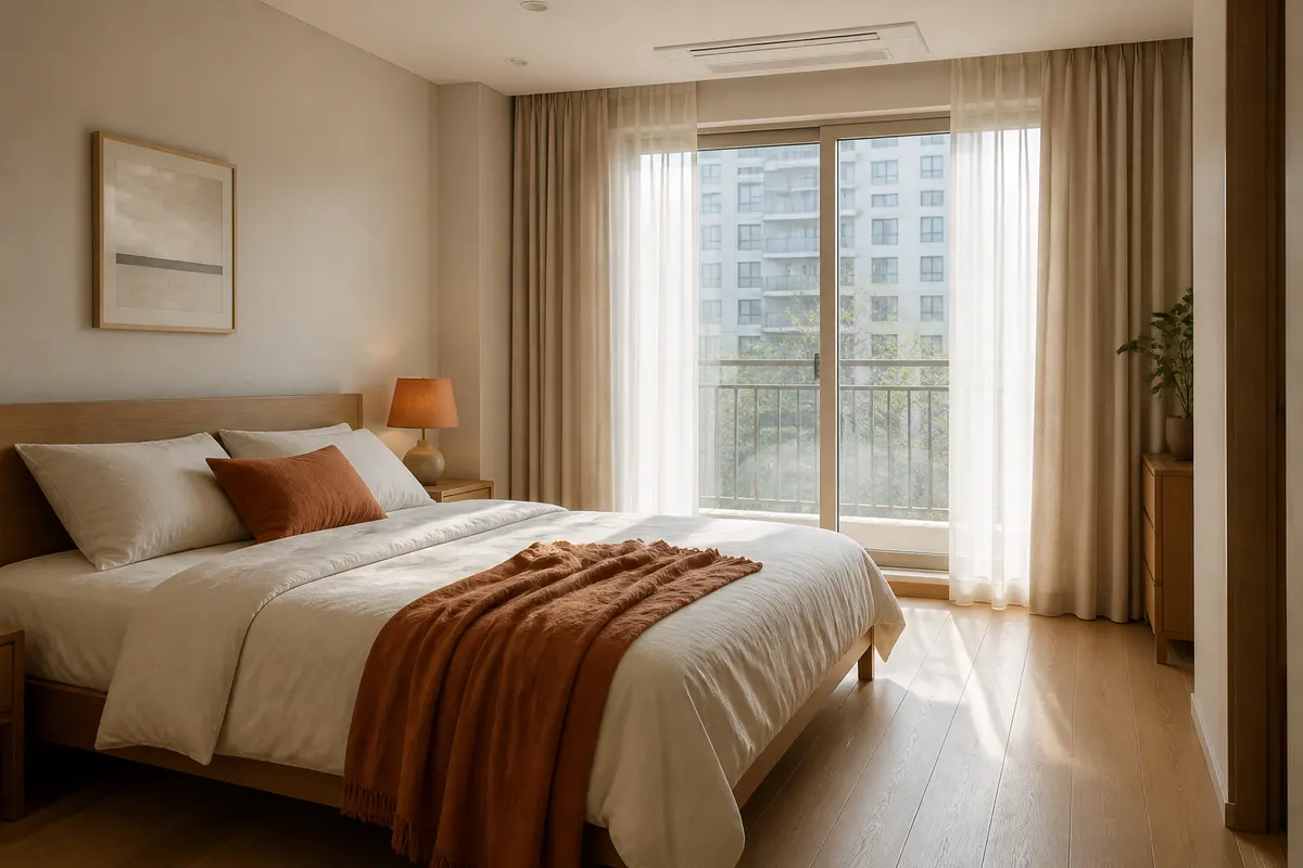 Textile accentA Cream Bedroom Warmed by Terracotta FabricThe walls and furniture stay calm, and the color sits on replaceable fabric surfaces.View reference
Fixed Surfaces Stay in View Longer
Walls, tile, kitchen cabinets, built-in wardrobes, doors, and film finishes are harder to change. Even when the colored area is small, the decision stays in view for a long time.
An entry-frame color appears every time someone comes home. A lower kitchen cabinet color is visible while cooking and from the living room. A colored bathroom tile wall becomes the first impression whenever the door opens.
For fixed surfaces, lower saturation usually carries less risk. Instead of a clear yellow, blue, or green, start with mustard, smoky blue, olive, terracotta, or another muted color that can sit beside neutral walls, flooring, wood, metal, and lighting. The important question is whether the color steps too far forward when it sits next to the home's existing materials.
A fixed accent does not have to be large to become memorable. That is why "can I live with this for a long time?" matters more than "does this look good right now?"
Keep Fixed Color Muted Enough to Live With
For niches and lower cabinets, look at area and saturation before the color name.
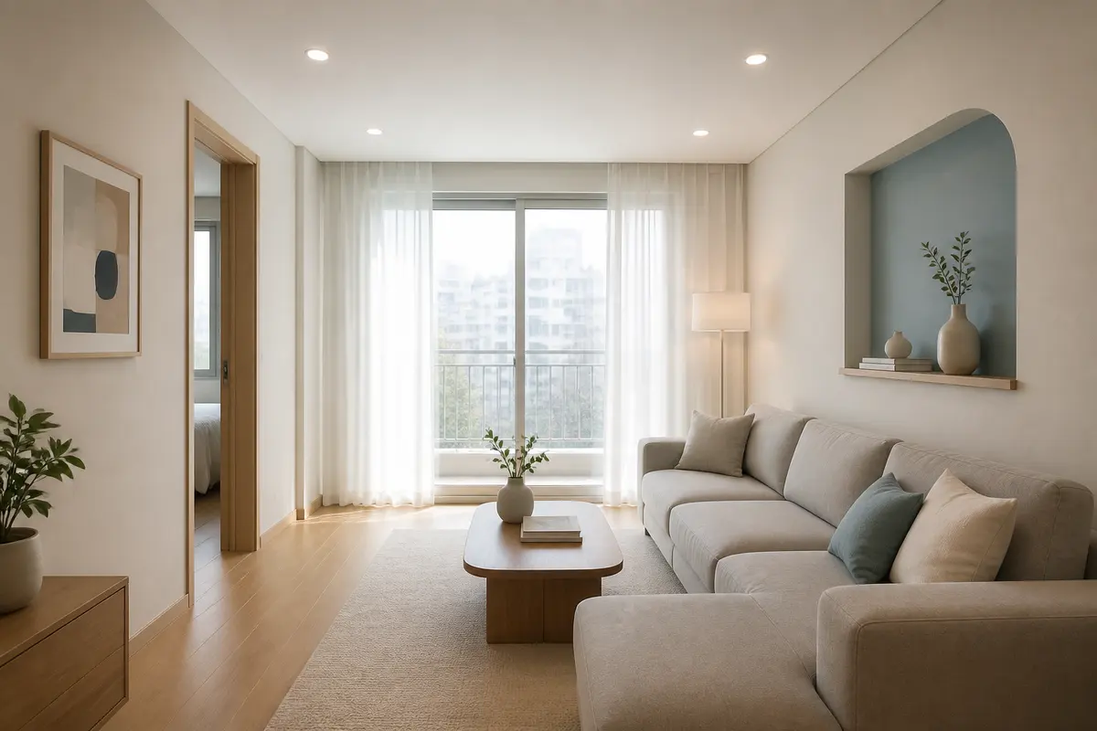 Fixed planeDusty Blue Kept Inside a Small NicheInstead of covering the full wall, the color stays on one small surface where the eye can stop.View reference
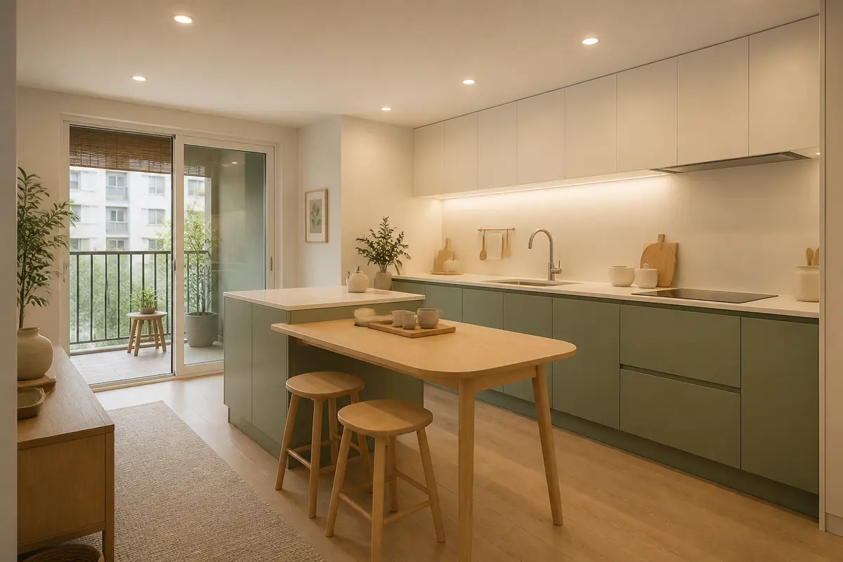 Kitchen baseSage Green Placed Low on the Kitchen BaseA fixed cabinet carries color, but muted saturation, oak, and cream keep it from pushing forward.View reference
Colors That Stay Visible in Entryways and Bathrooms
Small accents can last in memory when they appear every day or sit on surfaces that are hard to replace.
 Entry accentMustard Storage Seen First at the EntryA color seen at the entry has a strong first impression, so keeping it low and muted reduces the weight.View reference
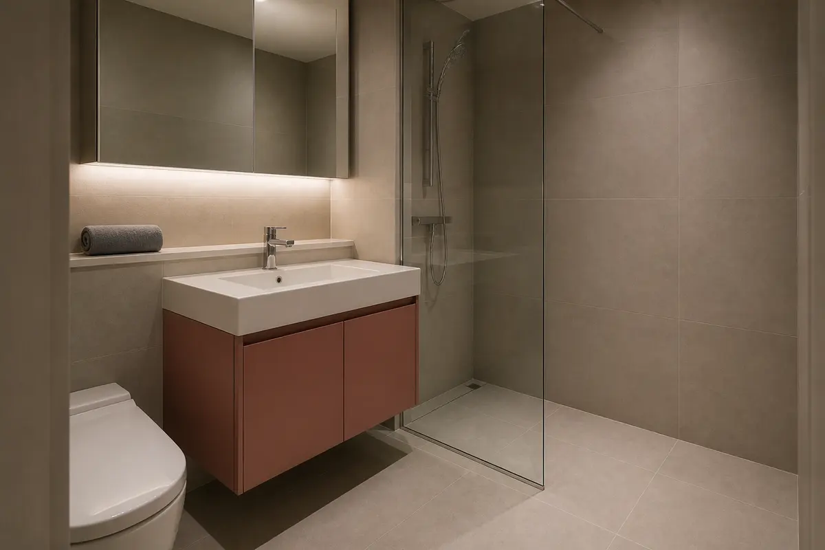 Bathroom vanityA Clay Tone Kept to the Bathroom VanityIn a room where finishes are hard to replace, a muted fixed surface is easier to live with than a vivid one.View reference
If the Color Is Saturated, Use Less of It
Saturation changes how large a color feels. One vivid red chair can appear before a much bigger dark brown table. A cobalt blue stool can stay stronger in a photograph than a beige rug that covers half the floor.
When you want a saturated color, reduce the area and quiet the surroundings. White walls, pale wood, ivory fabric, and matte metal can give the accent room to breathe. If the rug already has pattern, the wood grain is strong, or the wall finish is dark, another strong color can make the room feel crowded.
Muted colors can usually take more area. Gray-blue, earthy red, and low-yellow green can sit in the background more easily than a clear primary color. These colors still work as accents, but they do not always need to shout from the front of the room.
For long-term use, read the saturation before the color name. "Green" is less useful than knowing how vivid the green is. "Blue" is less useful than knowing how far that blue jumps away from the tones around it.
Adjust Saturation and Area Together
Muted color can take more area. Vivid color works better when the surface stays small.
Neutral Tones Change the Strength of a Color
Accent color never stands alone. The same color can look crisp beside white, softer beside beige, and calmer beside dark wood. A small color sample is useful, but it needs to be read with the surfaces around it.
In a bright white room, even a small color can appear sharply. A smaller area or lower saturation often works better. In a beige or wood-toned room, color may blend in more than expected. In that case, stay within a similar temperature but create a little more contrast in lightness.
In a gray room, cool colors can feel colder. If you want to use blue or green, warm fabric, wood, or lighting can keep the balance. In a room with a lot of reddish wood, more red or orange can quickly make the space feel dense.
Before choosing one accent color, name the base of the room. Is the home mostly white, beige, wood, or gray? That base tells you how strong the accent can be.
Small Colors That Repeat or Sit Slightly Back
A color can feel less isolated when it repeats, or when it appears on an inset surface rather than the front plane.
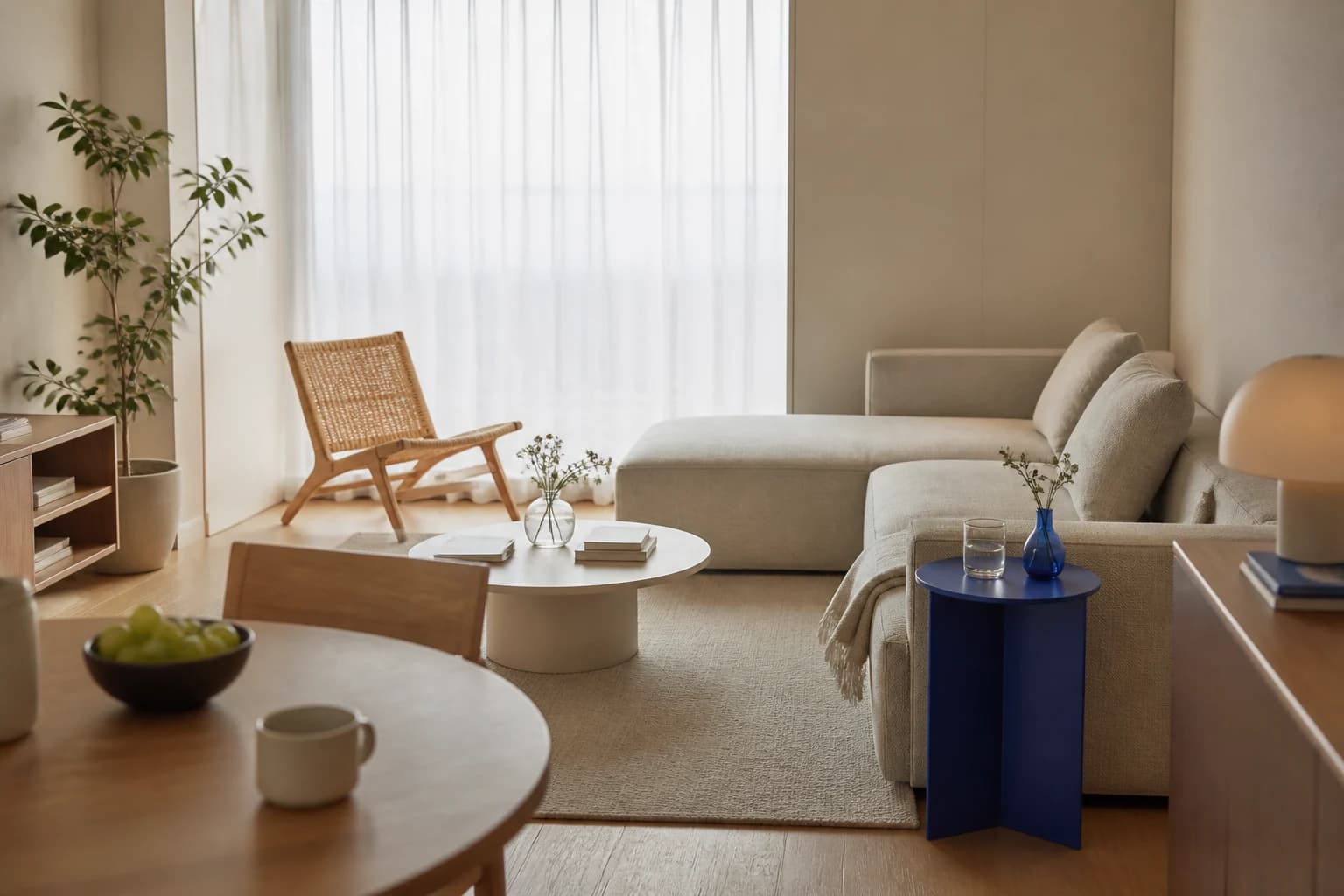
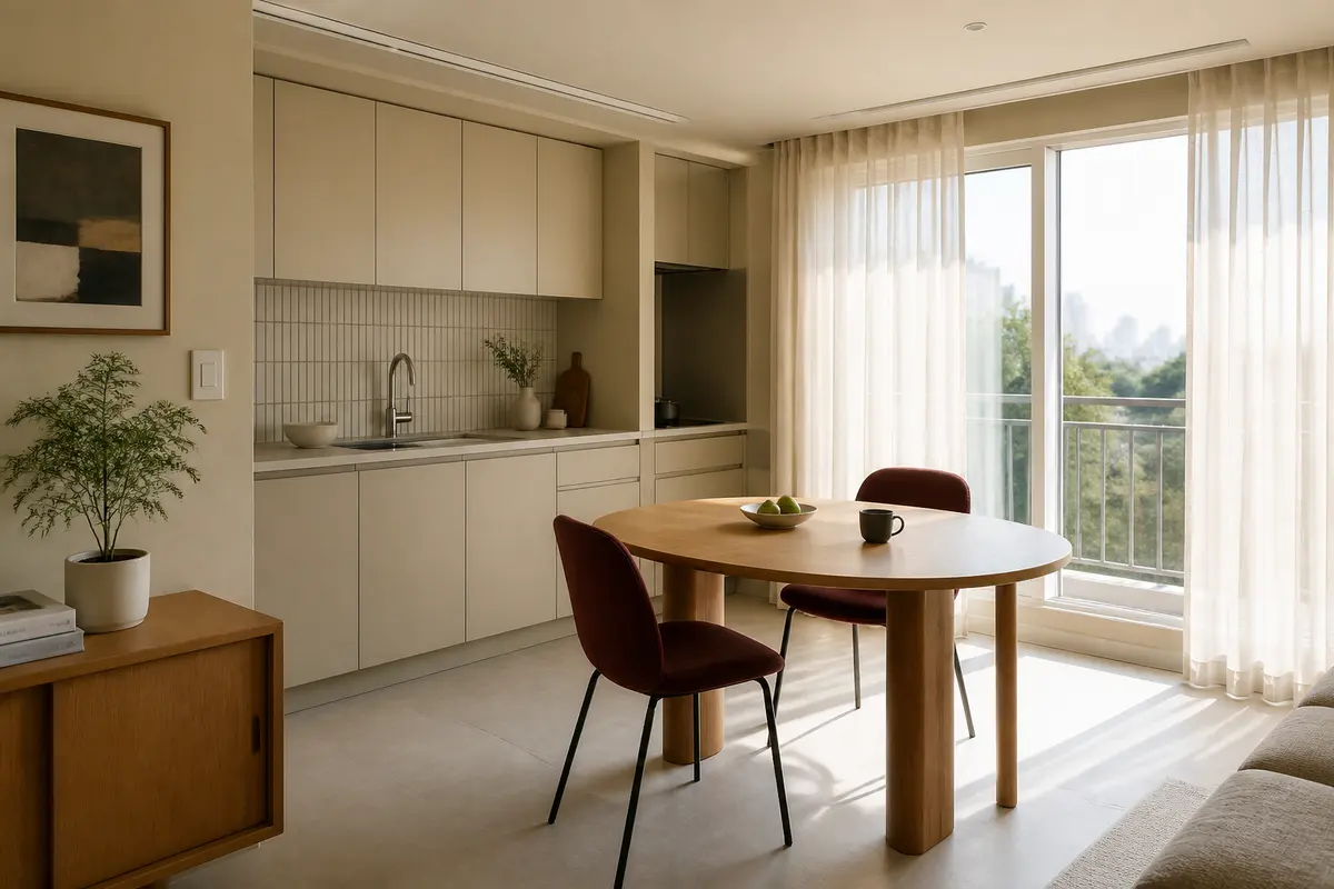 Repeated accentRhythm Created by Two Burgundy ChairsRepeating the color on chairs turns a single accent into a rhythm rather than an isolated spot.View reference
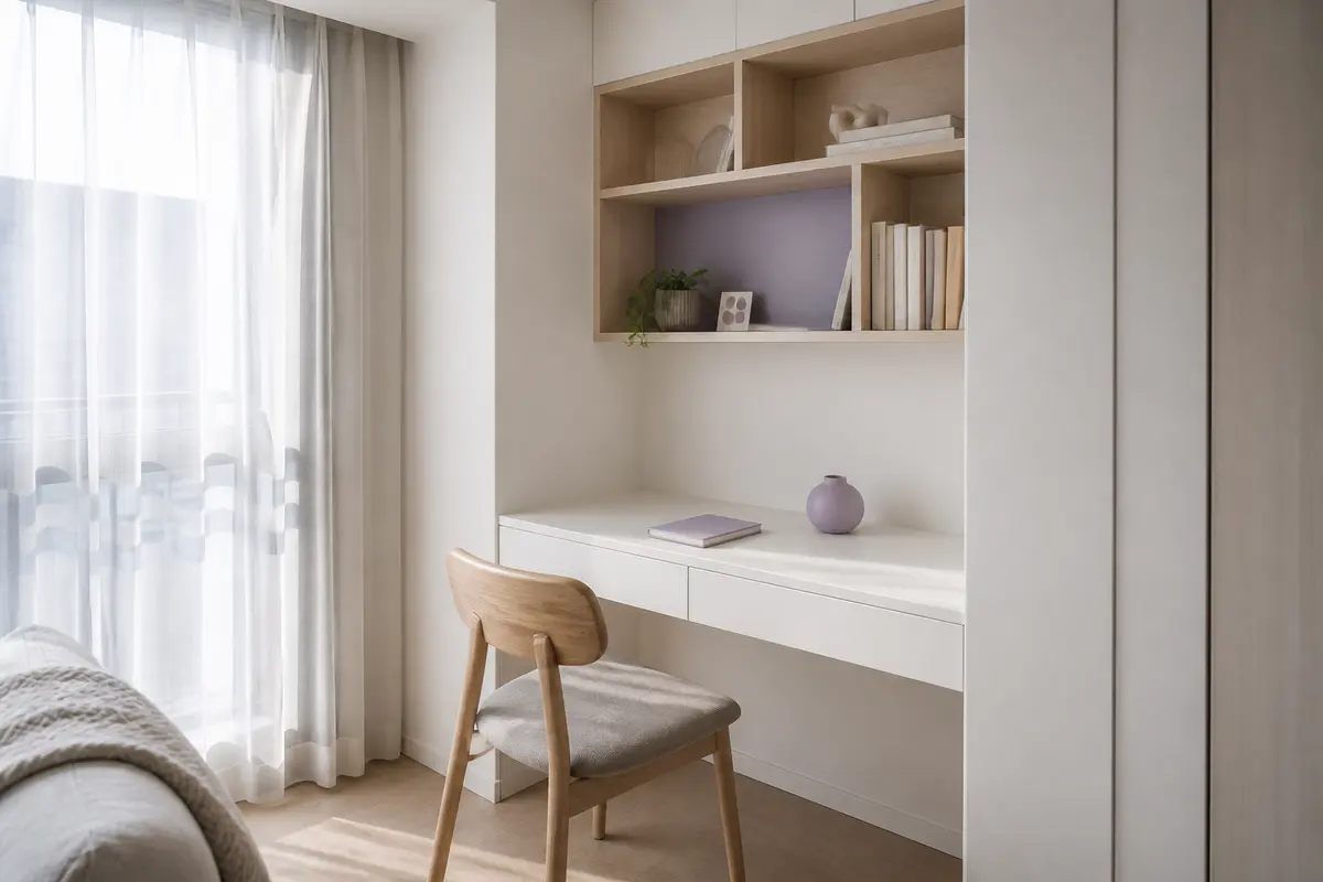 Inset accentA Lavender Accent Set Inside a ShelfWhen the color sits slightly back from the front plane, it stays visible without covering the whole space.View reference
In a Consultation, Talk About the Role of the Color
When you bring references to a consultation, "I like this green" leaves the conversation too open. Add the role of the color, and the discussion becomes more useful.
"I do not want a full wall. I want the color only on something I can change, like a chair or a small shelf."
"I want color on the lower kitchen cabinets, but I prefer a muted tone instead of a clear, bright color."
"The living room feels too quiet. I want a seasonal accent on small surfaces, like cushions or a lampshade."
These sentences do not reduce taste. They give the consultant a clearer range to check. Accent color becomes easier to discuss when the conversation includes location, area, saturation, and replaceability.
A Small Color Can Change the Mood Without Redesigning the Whole Home
The useful thing about accent color is that it does not require a full redesign. You do not have to change every wall or replace every large piece of furniture. One small color can give the eye a place to stop. Repeated small colors can give the room rhythm.
That small color still needs a position. Check whether it sits at eye level, whether it stays in view for a long time, whether it can be changed later, and whether it sits too far away from the surrounding tones. With those checks, accent color feels less like a loud decoration and more like a way to tune the room.
Choosing an accent color is less about being brave with a strong hue. It is about deciding where the eye should pause.