Why minimal homes can feel cold
A white living room can look clean in a photo and still feel a little chilly once you live in it. The wall is tidy. The furniture is not excessive. Yet the room does not quite invite people to stay. It is not messy, but it seems to leave too little room for life to settle in.
The problem is often not the number of objects. It is that the remaining surfaces are too cold, the light lands flatly, or storage has pushed every trace of daily use out of sight. Minimalism can calm the eye, but when that calm does not meet the wall, floor, lighting, and fabric, the home starts to feel closer to a showroom.
The point of this style is not to decorate more. It is to leave enough warmth in the space after things have been edited out. Warm minimalism uses emptiness as the background where life can sit comfortably, not as the goal itself.
From cold minimalism to warmer minimalism
Recent 2026 interior reports show a clear move away from cold, perfect minimalism and toward warmer, more textured homes. NewHomeSource treats warm minimalism as a major direction for new homes, tying it to warm woods, organic texture, long-lasting color, and daily function. That is the most direct source behind the kind of not-cold minimalism discussed here.
That does not mean the style should be read as the one correct answer for the year. Homes & Gardens describes 2026 interiors as warmer, more layered, and more personal. Houzz's 2026 Emerging Summer Trends Report also points to tactile texture, curved forms, warm colors, and more personal rooms. The useful signal is not that one style has won. It is that attention is moving from cleanly edited rooms to rooms that can be touched, used, and lived in.
That difference matters. If you follow the trend by name, you simply consume another look. If you understand why the shift is happening, you can decide what to remove and what to keep in your own home.
The point is surface temperature before color
The easiest misunderstanding is to turn warm minimalism into an all-beige room. Cream walls, wood furniture, and linen curtains can certainly soften a space. But a room built only around color names becomes flat quickly. The same beige changes completely across matte wallcovering, limewash-like paint, wood veneer, linen, and a wool rug because each surface receives light differently.
The Spruce connects warm minimalism with warm neutrals, natural materials, organic shapes, layered texture, meaningful personal objects, and purposeful space. That frame helps shift attention from color to surface. A nearly white wall can feel warmer when glare is reduced and curtains or rugs soften the light. A dark wood, on the other hand, can feel heavy rather than warm if the finish is too glossy.
So the question does not end with which color to use. You need to ask what surface holds that color, how softly it spreads light, and whether it feels only cold or slick when touched.
Flat surface + strong reflection
Textured surface + strong reflection
Flat surface + soft diffusion
Textured surface + soft diffusion
Use this matrix less as a checklist to fill every box and more as a way to find why the room still feels cold. If the floor and wall already feel warm, adjust light direction and fabric before changing more colors. If curtains and rugs still leave the room flat, revisit wall sheen, the scale of storage doors, and the few everyday objects that should remain visible.
Choose color, material, and form together
For color, slightly warmed neutrals such as cream, ivory, oatmeal, and taupe are easier to handle than pure white. If you use gray, greige or warm gray usually works more gently with wood and fabric than a blue-gray. Accent color does not need to be loud or frequent. Small areas of terracotta, sage, soft brown, or muted camel can create a buffer between white walls and wood.
For material, choose surfaces that can be read once more: solid or veneered wood, linen, wool, rattan, matte ceramic, and natural stone. Houzz's 2026 home design trends describes tactile finishes such as textured plaster, stone, handmade tile, grasscloth, and boucle as ways to add warmth and layers without relying on color or pattern. The point is not to add many finishes. It is to layer different surfaces without making them fight.
References for surface and light first
Use these references to see how large surfaces such as ivory walls, oak floors, and linen curtains receive light.
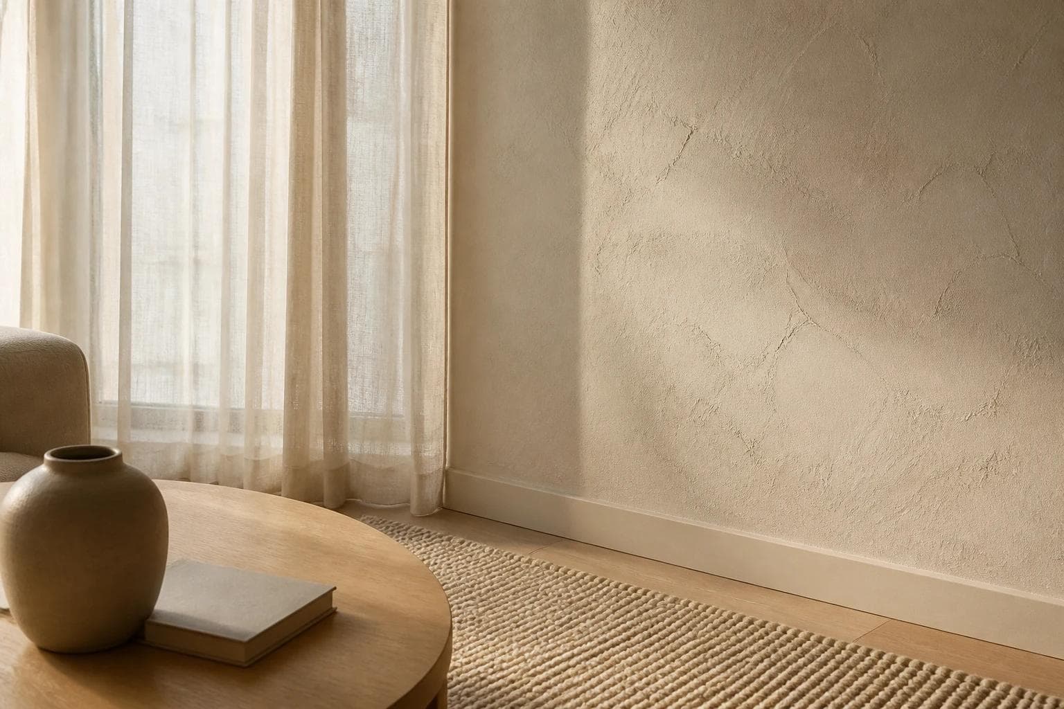
 Surface detailThe temperature of plaster walls and oak floorsA living room reference where surface density and the spread of light matter more than the color name.View the reference
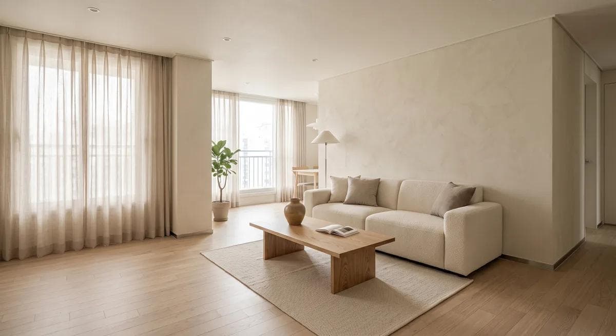 Surface detailNatural light on matte walls and fabricLook at how wall texture, fabric, and wood grain create a warm sense of empty space.View the reference
Material limits matter as much as mood. Matte ceramic takes light softly, but stains and water marks can show. Linen curtains feel natural, but near a kitchen they collect odor and dust. Wood counters and natural stone have depth, but water, heat, and stains need care. In a home with children or pets, washable covers, rugs with a sturdier weave, and wood that hides everyday marks may be more realistic than pale fabric everywhere.
Form should not be reduced to straight lines alone. A minimal home needs clean lines, but when every line is straight the room becomes tense. One rounded sofa arm, oval table, softly folded pendant, or curved chair back can change the expression of the whole room. This is also why wood grain and fabric texture matter. When a surface receives light softly, the room does not look empty even with little decoration. When the room is only flat white planes and glossy materials, the lack of objects makes the coldness more obvious.
Lighting and storage are structure, not decoration
Lighting is not just a color-temperature number. Even a 2700K bulb can feel sharp if the light falls hard on white walls and glossy floors. Aim the light so it reaches linen curtains, rugs, wood tables, and matte walls. With the same bulb, the room's temperature changes when the receiving surface changes.
Storage works the same way. If every everyday object is hidden, the photo looks clean. But if frequently used things have nowhere to return, the home soon becomes scattered again. In this style, storage is not a device for erasing objects. It is a structure that separates what can remain visible from what should be put away. A few books, a daily cup, a blanket that gets used, or a small vase can stay because they hold the temperature of daily life.
From this point on, warm minimalism is not a matter of choosing one nice image. It becomes a matter of seeing whether floor, wall, lighting, and furniture tones collide in the same frame. A combination that looked warm in a reference photo can look very different against your floor color, window direction, and existing furniture.
What to check by room
Living room
In the living room, start with the largest surfaces. If the floor, wall, sofa, and rug all carry different temperatures, small objects cannot easily repair the balance. With white walls and a pale floor, an oatmeal, greige, or warm brown sofa is usually easier than a cold gray one. For rugs, a visible weave often works better than a strong pattern because it keeps the room quiet without making it blank.
Living room references
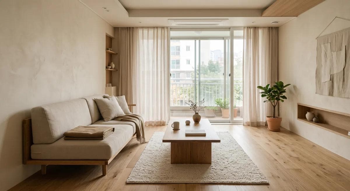
 Living roomA low-saturation living room with oak materialsAn example where the floor, wall, sofa, and rug sit within the same warm range.View the reference
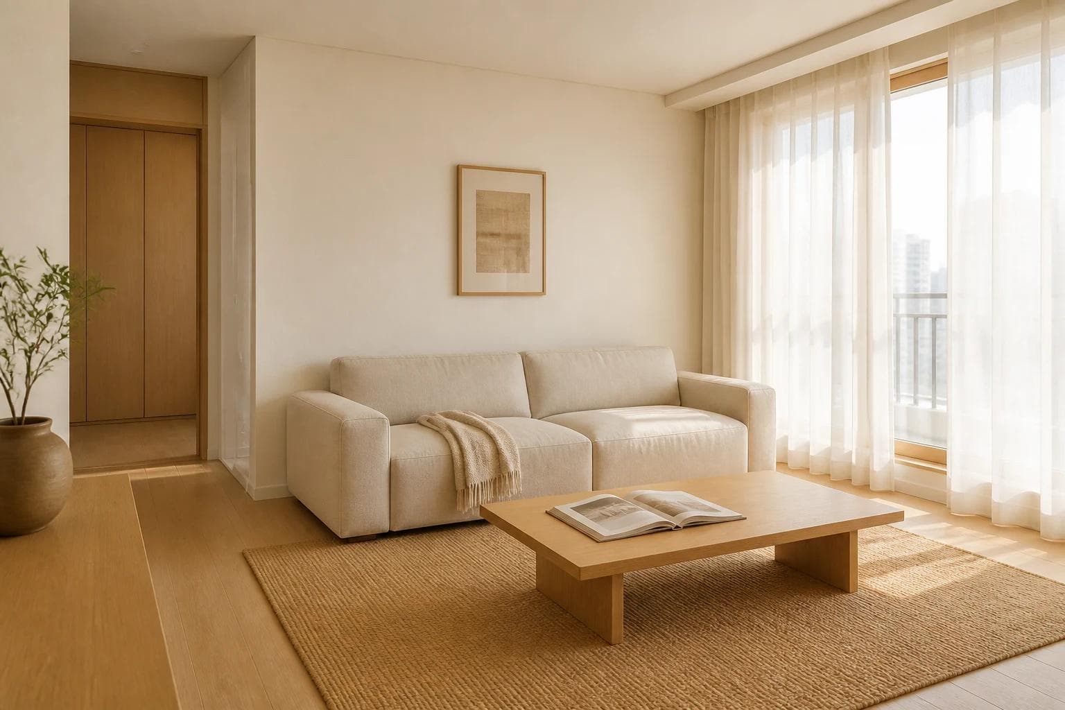
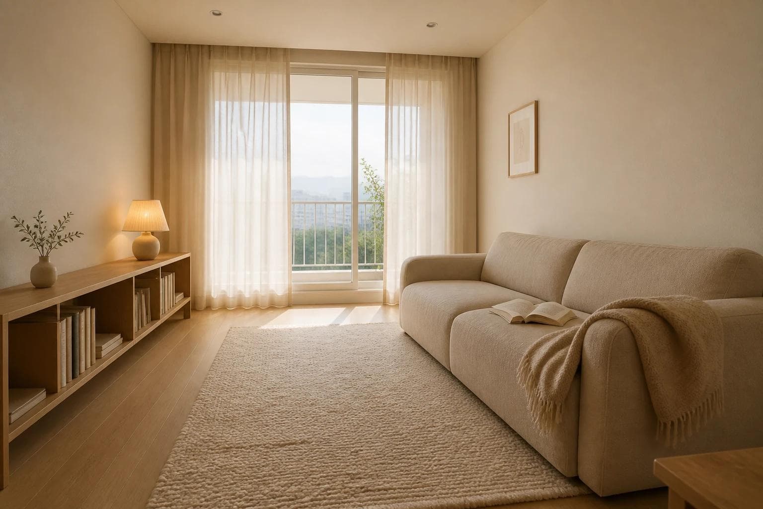 Living roomOatmeal fabric and pale oak flooringA living room that keeps objects sparse but uses sofa and rug texture to hold warmth.View the reference
Kitchen
In the kitchen, warmth and maintenance need to move together. Wood doors, matte tile, and cream-toned counters fit the style well, but this is also where oil, water, and stains appear. It is safer to choose manageable materials for the counter and backsplash, then add warmth through upper cabinet color, muted metal hardware, lighting, dining chairs, or fabric.
Kitchen references
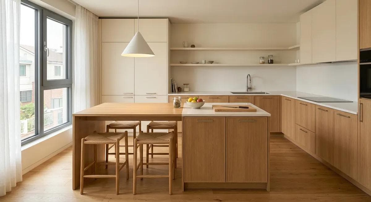 KitchenAn open kitchen with warm oak tonesAn example that uses matte surfaces and wood tones while still asking how the counter and wall will be maintained.View the reference
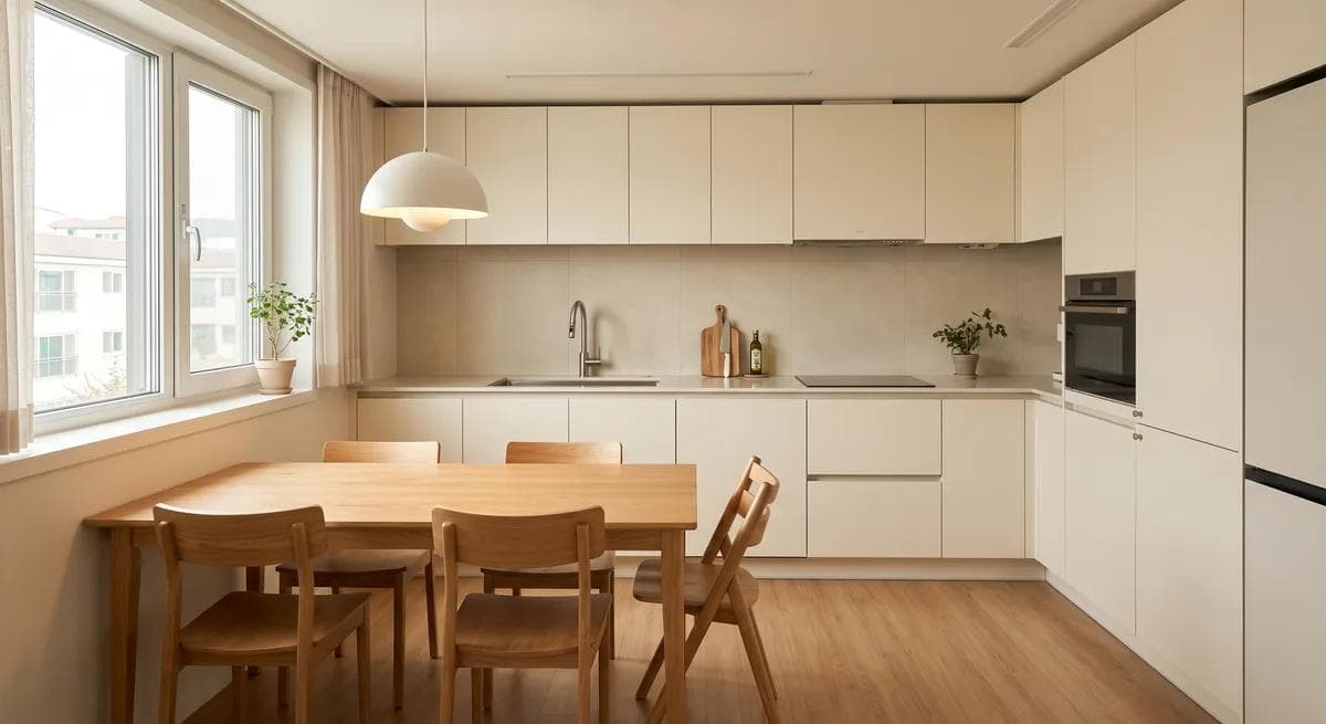 KitchenCream cabinet doors with an oak dining tableA kitchen where a wall-side worktop, separate oak table, and pendant light carry the warmth.View the reference
Bedroom
In the bedroom, light and fabric often matter more than color. All-white bedding can look hotel-like, but it may feel slightly cool for a room used every day for rest. Low-saturation bedding in ivory, oatmeal, or mocha beige, with texture added through curtains and a rug, can make the room quiet without making it cold. You do not need much decoration. A lamp within reach, a book in use, or a small wood nightstand can show the pace of daily life.
Bedroom references
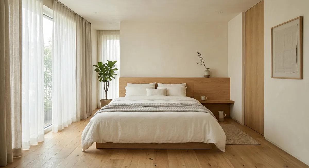 BedroomA quiet bedroom shaped by plaster and woodA reference for reading muted color, curtain texture, and the way daylight spreads before choosing white bedding.View the reference
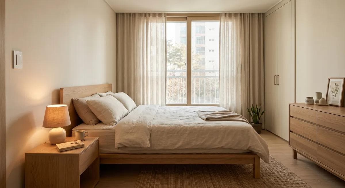 BedroomOatmeal bedding and low bedroom lightA bedroom that adjusts temperature through fabric layers and a wood nightstand instead of adding decoration.View the reference
Interpreting references for your own home
To use warm minimalism well, avoid copying a reference image as-is. The home in the photo has its own flooring, window direction, ceiling height, furniture scale, and shooting light. The same cream wall and wood furniture can look yellow in your home, or lose definition and look washed out.
First, separate what you like in the reference. Is it the color, the wood tone, the direction of light, the low furniture, or the small number of objects? Then compare that with the conditions in your home that are hard to change, such as floor color, window direction, built-in storage, or the kitchen counter.
You do not need to find the perfect combination from the start. When a reference scene feels right, ask where its quietness comes from. Is the white wall itself doing the work, or is it the oak floor? Is the curtain filtering the light once before it enters the room? Is the rug reducing the empty feeling underfoot? This turns the question from which color should I copy into what should remain in my home so it feels less cold.
An edited-down home can become cold through small differences, and warm for the same reason. Before buying another large piece of furniture, look first at the wall, floor, light near the window, and the place for objects your hand reaches for often. When those are adjusted, the home feels less like an undecorated room and more like a background people can stay in.